Marketing 101 says you need a rebrand every ten years, but one day you realize your company’s visual identity doesn’t express its values and vision—what then? Rebranding is a big decision—it can seem to go on forever, like a kitchen remodel. There are implications that arrive from every corner of the business, from the Gdrive to the email signatures, social media identities, Hubspot brand kit management, and a million other places where the old brand fingerprint is lingering like some archeological relic. What comes prior are the woodshedding sessions with the stakeholders with the head scratch questions (what is your why? How do you want others to see your brand?); the slow journey to consensus.
OnPath CEO Brian Borg realized that the OnPath visual brand identity, with its earth tones with generic cartoon-type illustrations, did not reflect the brand’s intelligence (both technical and soft), confident competence (slight swagger from 15 years in the QA testing space), and sophisticated problem-solving capacity. Borg and his COO Lon Botta had paid their dues by creating and refining a solid business blueprint, but again, realized that their principles and vision were not captured in OnPath’s optics. They started by rethinking their logo. OnPath’s former gold circle logo, with a vague white directional indicator, was forgettable, and Botta and Borg knew it.![]()
Designers will tell you that logos are a special challenge. You can use a cheap-to-free platform like Canva, or spend thousands on a logo designer, but logo development will never be easy. Translating a brand’s DNA into a memorable, meaningful visual is a huge creative challenge. Logo designs can be too clever, with the symbolism flying over the head of viewers, or forgettably simple. Designers can be overly influenced by what they see in the branding space, going for safe, predictable concepts that don’t rock the boat but are underwhelming. Botta, who led the project, wanted something cool and slightly disruptive that stopped the social media scroll and could double as actual fine art.
Ideas were tossed, prototypes solicited, and competitor brand research conducted, but a vision did not emerge until they came across a simple diagram of the classic Golden Ratio expressed through the Fibonacci Sequence.
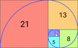
Botta and Borg understood that the infinite spiral could represent the path, or journey of the software development life cycle (SDLC) under optimal conditions — free of tech debt, bottlenecks, and stalls. The spiral could symbolize an SDLC in a state of “flow,” or creative productivity carried out by inspired, gratified developers.
The Fibonacci Sequence
Loved for centuries by mathematicians (Euclid, Pacioli, Pythagoras), artists (Le Corbusier, Salvador Dali, Leonardo da Vinci, Hokusai, etc…), musicians (Mozart, Bartok), programmers, Walt Disney, and nature herself, the Fibonacci Sequence/Golden Ratio perfectly express the intersection of art, science, and natural processes, and is a universal symbol of balance and harmony. One paragraph is inadequate for describing the significance and beauty of these principles. Botta and Borg embraced it as their logo concept.
Botta, with a love of modern art, asked designers, “Can we do this in Mondrian colors (primary colors plus black and white)? The answer was yes, you can do it in any colors you like. A color palette of red, blue and yellow was devised with the addition of green and turquoise blue. With brand colors, it’s not enough to choose ones you like, that are pleasing to the eye — colors must have symbolic meaning. According to OnPath’s press release, “The new colors represent clarity (yellow), dedicated, sustained energy (red), honesty and pragmatism (blue), growth (green), and transparency (aqua blue). ![]()
Enter Euclid
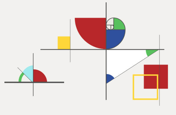
While the new logo was a great starting point for the full rebrand, a visual strategy was needed for the company website. Expanding on the Mondrian theme, designers adapted a Swiss grid format to complement the logo’s geometry, but hit the wall trying to create enough assets derived from the spiral and rectangle alone.
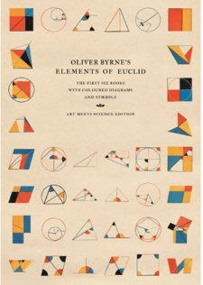 By introducing Euclidean geometry, the mathematical study of shapes and figures, possibilities for meaningful design expanded exponentially. Nineteenth century author Oliver Byrne foreshadowed 20th century modern and abstract art movements when he published a book of illustrations of Euclid’s formulas in 1847. His text provided a rich resource and inspiration for website page hero illustrations, icons, and graphics.
Using Byrne's work as a reference, the designers and developers were able to generously populate the website pages with elegant geometric forms that clearly convey meaning. OnPath took an interesting departure from the ossified marketing commandment that marketing materials, such as social media posts, ads, and websites, must contain mandatory images of happy, shiny people, regardless of industry. By using abstract figures (rather than human forms) to express the brand’s unique value proposition of deep insight into the human experience in software development, OnPath broke the rules with a visual identity that flies high above the horizon line within the QA testing industry. The new brand identity is fresh and original, but sophisticated, and free of any hint of convention.